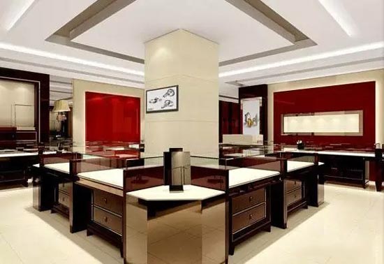
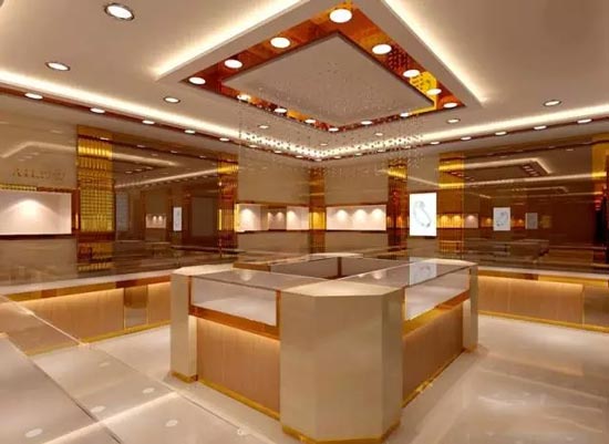
A good jewelry display cabinet, or a showcase with grades, has different themes, different tastes in it, the decisive factor is the color of the showcase, just like the cosmetics showcase is generally pure white, red and white and other bright colors It gives people a bright and clean feeling, while the jewellery showcases are more expensive with golden yellow, rose, brown, etc. There is a generous and noble feeling. The costumes have different seasons and different styles, creating different styles of clothing showcases. . From the following three points, we can be deeply aware of the impact of color on the design of the showcase and the production of jewelry display cabinets.

1. According to the theme of the jewelry display cabinet and the showcase time to determine the color tone of the exhibition, whether it is high-profile, or low-key; is warm, or cold-tuned. For a high-end showcase with a historical theme, the color should be dominated by heavy, calm and low-key to reflect a historical change of vicissitudes and the dignity of traditional culture. For some exhibition-oriented showcase activities, it is always designed to be close to the active high-tone of life, to stimulate visitors' desire for consumption, to warm the atmosphere of trading, and to promote the occurrence of on-floor transactions.
Most of the commercial jewellery showcase activities use neutral, soft and gray tones to highlight the exhibits and to achieve color harmony. In terms of showcase time, it is necessary to fully consider the seasonal heat and temperature, and the temperature difference is biased in color design. For example, in the winter showcase, the outdoor is cold, and the color design in the whole exhibition hall should be based on warm colors, giving people a sense of "warmness and warmth", which is consistent with people's psychological needs.
Similarly, in the summer showcase, the outdoor temperature is very high, the design should be based on cool colors, giving people a sense of calmness and coolness. Visitors will naturally appreciate the showcase.

2. According to the nature of the showcase and the logo of the showcase, the special color of the showcase in Shenzhen will be determined. In general, the standard color of the jewelry showcase logo is the showcase-specific color. A jewelry cabinet has its own standard color. In the color design of the exhibition hall, the special color of the showcase should be fully utilized, including wall posters, hanging flags, POP advertisements, indicating signs and so on. When visitors enter the exhibition hall, they have sufficient visual contact with the logo color of the showcase, thus forming a deep memory of the tall display cabinet logo, which is conducive to the formation of the brand effect of the display cabinet. At the same time, it is conducive to the harmony of the color of the venue.
3. Determine the color relationship between the exhibition areas according to the location of the exhibition area. There is a unity and individuality change between the exhibition areas, making it a rhythmic rhythmic color relationship. From the perspective of the entire exhibition area, the color tone should be harmonious and unified, and the color of each exhibition area is a kind of inheritance and gradual relationship with each other.
At the same time, each sub-exhibition area has formed a color tone that is more in line with the nature of the exhibits in this exhibition area, and has certain differences from the color of other exhibition areas. Not boring and boring, but losing interest in inquiry, and not causing confusion and confusion, do not know what to do.
Chair Cover,Chair Seat Covers,Dining Chair Covers,Dining Room Chair Covers
changshu tokoh-tex trade co.,ltd , https://www.tokohtex.com
![<?echo $_SERVER['SERVER_NAME'];?>](/template/twentyseventeen/skin/images/header.jpg)